

The geographical distribution of the difference in observed surface temperature between the recent 25-year period 1991–2015 and the 30-year reference period 1961–1990 is shown in Fig. 1b. The difference may be used as an indicator of the local temperature trends during the past half century when the multi-decadal rate of global warming is the most pronounced. The observed change thus obtained is compared with Fig. 1a, which illustrates the distribution of the predicted change in surface air temperature in response to the doubling of atmospheric concentration of CO2. In order to facilitate comparison between the geographical patterns of predicted and observed surface temperature changes that are different by a factor of ~5, colours are chosen such that the values at the various colour thresholds in Fig. 1a are five times as large as those in Fig. 1b, highlighting the warming patterns.
a, Change in coupled atmosphere–ocean model realized by the ~70th year (the average between the 60th to 80th year) of the global warming experiment, when the atmospheric concentration of CO2 doubles5. Here surface air temperature is obtained from the atmospheric model level closest to the earth’s surface (~75 m). b, Observed change from the 30-year base period around 1975 (1961–1990) to the 25-year period around 2002 (1991–2015). The map is obtained using the historical surface temperature dataset HadCRUT4 described by ref. 18. Note that, in the Southern Ocean poleward of 60° S, the observed change is not shown because data are hardly available in winter.
Comparing the observed change with the model projections, one notes that the land areas warm faster than adjacent ocean areas in both the model and in the observations11. The warming tends to be largest in high northern latitudes due mainly to the positive albedo feedback of snow and sea ice5, 6. In the model results (Fig. 1a), warming is a minimum in the northern North Atlantic: this is not so pronounced in the observations (Fig. 1b). In the model, this minimum is attributable not only to deep, convective mixing of heat but also to the weakening of the Atlantic meridional overturning circulation5, 6, 12. In sharp contrast to most of the high northern latitudes, temperature change is small in the Southern Ocean in the model results. The area of small temperature change is also seen in the observations. If the observed trend of little or no warming continues in the Southern Ocean, it will confirm this surprising early model finding. The pattern in the surface air temperature response, highlighted above, is also seen in the multi-model ensemble found in the recent IPCC Working Group I Fifth Assessment Report (ref. 13; Figs 12.10 and 12.11).
It is quite surprising that the observed and projected pattern of surface temperature change are very similar to each other, when one realizes that the distribution of the thermal forcing of the model is likely to be different from that of the actual forcing. The similarity between the two patterns suggests that the geographical distribution of surface temperature change may not depend critically upon that of thermal forcing. It also suggests that the model likely contains the key physical processes that control the geographical pattern of global warming at the earth surface.
Zonally averaging the relatively short observational data can help improve the signal-to-noise ratio. This is particularly the case when looking at sub-annual changes. As shown in Fig. 2 (and ref. 14), the Northern Hemisphere high latitude warming is large in the late autumn through to winter and into the spring, though there is a summer minimum in both the model and observations. In sharp contrast, in the observations near 57.5 °S, there is a minimum in the warming throughout the year. Further south there is not enough data to reliably compute the monthly means in winter. In the model, the warming minimum extends southward toward Antarctica. The seasonal and latitudinal profile of the observed warming appears to be broadly consistent with that of the warming obtained from the model, though there are notable differences in details. For a full discussion of the physical mechanisms of the seasonal variation of surface temperature change, see refs 7, 15 and 16.
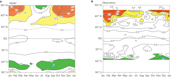
a, Seasonal variation in the coupled atmosphere–ocean model realized by the ~70th year (that is, the average between the 60th and the 80th year) of the global warming experiment, when the atmospheric concentration of CO2 doubles6, 14. b, Seasonal variation from the 30-year base period (1961–1990) to the ~20-year period (1991–2009)14. (To facilitate the comparison between the profile of zonal mean temperature change in Fig. 2a with the profile in Fig. 2b, the colour areas are chosen such that the contour values at colour thresholds in Fig. 2a are five times as large as those in Fig. 2a. This selection is made because the zonal mean changes in Fig. 2a are approximately five times as large as the change in Fig. 2b.) Temperature is in °C.
As is the case with surface air temperature, the observed 50-year trends of zonally averaged temperature in the upper 2,000 m layer of ocean17 shown in Fig. 3b have a similar pattern to the model projections5. As seen in the projected change (Fig. 3a), the positive temperature trends are large in the near-surface layer of ocean and decrease with depth. It is of particular interest that the layer of positive temperature change penetrates deeply in the Antarctic Ocean around 60° S and 75° S as well as in the northern North Atlantic Ocean around 75° N. In these regions, where deep convection predominates, the effective thermal inertia of the ocean is very large due mainly to the deep mixing of heat6. Thus, the warming at the oceanic surface is reduced greatly and is small in these regions as shown in Fig. 1a.
![Zonally averaged ocean temperature ([deg]C) change.](http://www.climatechange.ie/wp-content/uploads/2017/03/www.nature.comnclimate3224-f3-eccc1dd2ade6501b8e04b60e2962a7a1cd9befe0.jpg)
a, Temperature change for the entire ocean of the coupled atmosphere–ocean model realized by the ~70th year of the global warming experiment, when the atmospheric concentration of CO2 doubles5. Temperature is in °C. b, Linear trends (°C per 50 years) in the upper 2,000 m layer of ocean during the 50 year period 1950–2000. Panel b is adapted with permission from ref. 17, IPCC.
Broadly speaking, the distribution of the simulated oceanic temperature change described above is in qualitative agreement with that of observed change, though the observed temperature change is not shown below the depth of 2 km because of poor data coverage. Nevertheless, it is encouraging that in the high southern latitudes, the layer of positive temperature change extends downward to a depth of at least 2 km.


