
Posted on 6 December 2017 by John Abraham
The US Global Change Research Program recently released a Climate Science Special Report. It is clearly written – an authoritative summary of the science, and easy to understand.
The first main chapter deals with changes to the climate and focuses much attention on global temperatures. When most people think of climate change, they think of the global temperature – specifically the temperature of the air a few meters above the Earth surface. There are other (better) ways to measure climate change such as heat absorbed by the oceans, melting ice, sea level rise, or others. But the iconic measurement most people think of are these air temperatures, shown in the top frame of the figure below.
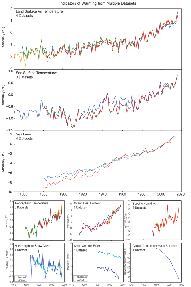
The top chart is shown as a temperature “anomaly,” which means a departure from normal. Right now the anomaly is nearly 2°F, meaning that we have warmed 2°F from what the normal temperature should be. The graph shows four datasets, so it doesn’t matter whose temperature data we use; the results are the same. Global land-air temperatures have been rising pretty steadily since approximately 1960.
The next graph shows ocean surface temperatures. They too are rising and have been increasing for a number of decades. Sea surface temperatures are determined from satellites, from sensors on ships, and from floating instruments spread across the ocean. Over the decades, we have obtained better coverage of the ocean. Decisions are made from different research teams on how to combine measurements from different instruments and how to interpolate between measurement locations. But regardless of the decisions made, we see the temperatures rise.
The third graph shows sea level. It has been rising for more than a century. Sea level rise is a favorite measurement for scientists because it integrates the heat added to the Earth’s climate. The heat ends up in the ocean waters and causes the waters to become less dense. The lower density of water causes much of the sea level rise in the graph.
The center two images in the lower rows respectively show the amount of heat in the ocean and changes to Arctic ice. We see that ocean heat content is increasing and the amount of ice is decreasing. The lower right image represents the mass of the world’s glaciers. The decrease in glacier mass as glaciers warm, melt, and flow to the oceans is shockingly fast.
Take some time to think about these climate signals. The figure shows nine different measurements, and all of them are consistent with a warming climate. So, next time someone tries to argue that we don’t really know if climate change is occurring, just remind them that all the signals show a global warming.


